Showing posts with label Modern Art. Show all posts

Thursday, 3 October 2019

Antony Gormley at the Royal Academy

Antony Gormley at the Royal Academy is a very challenging exhibition in a number of ways:
Clearing VII 2019
It is physically challenging because the viewer is forced to engage with the exhibits. Clearing VII is made from eight kilometres of square-section aluminum tube which coils around the space. Viewers have to pick their way through the exhibit to get to the next gallery and then find their way back. Perhaps the most demanding exhibit was undoubtedly Cave 2019 which entails stooping and feeling one's way to navigate one's way through a pitch black iron tunnel which leads to a four-metre high cave and then exit through another tunnel.
Host 2019
In comparison to most other Royal Academy exhibitions the logistical challenge of assembling some of these exhibit must have been significant. Several of these exhibits (Clearing VII, Cave and Matrix III) are on such a monumental scale that their assembly in situ involved shifting literally tons of metal and suspending many of them on the walls and from the ceiling. The greatest challenge was probably Host 2019 which transforms one of the galleries into an expanse of clay and seawater (Will the wooden floors ever recover?!). Many of these exhibits were clearly designed for this exhibition in this space. They are unique and will never be experienced in quite the same way even if they are reassembled in a different gallery.
Flesh 1990
In his concrete works Flesh, Passage and Press 1990-93, Gormley challenges the traditional notions of space and form. At first glace they look like concrete blocks, but on closer inspection they are hollow and the void in the shape of a human body: they are 'inverse sculptures' - prompting the viewer to re-evaluate the physical volume which we occupy.
The biggest take-away for me was that this exhibition challenges the norms of how viewers engage with art. It is a far cry from the RA gallery rules which are literally etched into the wall. Indeed Gormley manages to push the boundaries of what constitutes 'gallery art'.
Having previously seen Antony Gormley's famous outdoor installation masterpieces The Angel of the North and Another Place  (on Crosby Beach), I confess I was intrigued whether or not his sculptures would translate to the iconic galleries of the Royal Academy. I was not disappointed.

Me, engaging with Lost Horizon 2008

Thursday, 3 October 2013

Lowry and the Painting of Modern Life at Tate Britain - Art Review

I guess I've always had a soft spot for Lowry, and yes, it's sad to admit it (and here goes any hope of credibility as an art critic) but it goes back to Brian and Michael's number one hit of 1978. Like the popular song, Lowry's work somehow captures a bygone world. 
Sitting as a distant but interested observer, Lowry presents the viewer with images that capture the rhythms of life of his native Salford. The mills may be the perennial backdrop, but Lowry primarily is concerned with people and the impact that industrialisation is having on them. There is something fundamentally human about Lowry's work - he is fascinated by crowds and the congregation of people.  He may abbreviate the human figure into "matchstick men" but he never dehumanises them. Even in crowd scenes, we can discern the gender and age of the individual; all brought to life in a few economic brush-strokes. 
Lowry's portrayal is neither romantic or nostalgic and does not shy away from portraying a polluted and desolate industrial wasteland (River Scene, 1935) or the broken bodies that inhabited it (e.g. The Cripples 1949). 
The Exhibition 
Given that Salford Quays now houses an extensive permanent collection at the iconic building named after the artist, one would be forgiven for questioning the need for a major retrospective in the capital at all. Perhaps it was some sort of cultural exchange to compensate for so much of the BBC moving north!). However, this exhibition is a fitting tribute to one of the greatest British artists of the Twentieth Century. Lowry presents a challenge to curators in that there is relatively little progression and development in his work. I am not convinced by the view (expressed on the excellent audio guide) that his work was generally more optimistic in the post-war period. At times he seems to be reinforcing the Private Eye mantra that "It's grim up North" and this can be extended to his Welsh canvasses "It's grim in Wales, too!"
Just for fun


Saturday, 31 August 2013

Chagall Modern Master - Tate Liverpool - Review

Tate Liverpool has established a reputation for putting on a major exhibition each summer that takes a somewhat quirky approach to the artist (Picasso Peace and Freedom 2010; Magritte the Pleasure Principle 2011; Turner, Monet, Twombly 2012). Chagall Modern Master, like its recent predecessors, does not set out to be a comprehensive biopic, rather it focuses on a formative period in the artist's career. The exhibition draws out the importance of the three years in Paris (1911-14) and their influence on the subsequent eight years in Russia (1914-22). 
The decade 1911-22 saw Chagall move from St Petersburg to Paris, where he engaged with the Cubist movement and was one of the most productive and successful times of his career. Chagall's happy sojourn in Paris came to an end in 1914 when the outbreak of WWI prolonged an intended three month visit to relatives in Vitebsk to eight years. 
Some of the undoubted highlights of the exhibition are the large canvasses, such as I and the Village (1911), The Green Donkey (1911) and The Soldier Drinks (1911-12), that combine Parisian Cubist and Fauvist influences with what became his signature themes depicting aspects of the life of Russian Jewry and of his native Vitebsk. 
This period was when Chagall became engaged (1910) and subsequently married (1914) to Bellamy Rosenfeld and thus it is understandable that some of the subject matter explores the theme of love. Lovers in Blue (1914) is an exquisite piece that captures the tenderness of moment as the couple's lips fuse into one. 
The curators are to be congratulated on bringing together such a broad range of canvasses from this period. In particular, it was a treat to be able to see "Chagall's Box" (1920) reconstructed in one room. This work comprises a series murals that were commissioned for the State Jewish Chamber Theatre: Introduction to the Jewish Theatre, Music, Dance, Drama, Literature, Love on Stage and The Wedding Feast. The exhibition closes with a rather odd glimpse of Chagall's later works, which, although the individual pieces were of merit, rather detracted from the initial theme, giving the (false) impression that the curators had run out of steam.

Chagall Modern Master is at Tate Liverpool until 6th October and is well worth the visit.

Sunday, 24 February 2013

Lichtenstein: A Retrospective at Tate Modern - Review

Roy Lichtenstein's comic-strip canvasses established him as one of the leading exponents of American Pop Art and one of the most influential and recognizable artists of the twentieth century.
Lichtenstein: A Retrospective at Tate Modern is the first comprehensive account of his art since his death in 1997 and sets out to reassess "Lichtenstein's enduring legacy".  The inevitable consequence is an exhibition that is, like Lichtenstein's career itself, hit and miss.
Lichtenstein is at his best when he is parodying some aspect of society, whether that be the cliched portrayal of women in the press and advertisements, or the glorification of war in comic books, or, indeed, other artists. The rooms that explore these aspects are the undoubted highlights of the exhibition.
Lichtenstein, Drowning Girl, 1963
Lichtenstein's iconic Ben-Day dot Pop Art paintings are stunning and the room which focuses on 'War and Romance' brings together a number of the comic-book canvasses, which made him famous. The strength of many of these works is Lichtenstein's interest in the 'pregnant moment' which leave the viewer hanging and having to fill in the details of the missing surrounding narrative:
"Oh Jeff, I love you too, but ..." (Oh Jeff, 1964"I don't care!  I'd rather sink than call Brad for help!" (Drowning Girl, 1963)
"That's the way it should have begun! But it's hopeless!" (Hopeless, 1963)
Lichtenstein Femme d'Alger, 1963
Likewise, the room 'Art about Art' explores the ways in which Lichtenstein translated key works by other artists whom he admired, such as his Femme d'Alger 1963, which reworks Picasso's Woman of Algiers, 1955 in Bed-Day style.
However, this exhibition also explores the lows of Lichtenstein's career.  The gallery guide dutifully introduces: "The Perfect/Imperfect series is a relatively unknown group of works, which explore the vocabulary of abstraction with geometric fields that challenge the edges of traditional canvasses."  These are a "relatively unknown group of works" for a reason - they are very poor. Nowhere are the lows seen more clearly than in the Room 'From Alpha to Omega: Early Abstractions and Late Brushstrokes' which juxtaposes some of Lichtenstein's works from 1959-60 with some of his later ones from 1996. I applaud the curators on the inclusion of these "little-known" works in the Retrospective as gives us a complete picture which allows us to reassess "Lichtenstein's enduring legacy".  In short, his work was quite poor when he deviated from his Ben-Day dot parody winning-formula, which interestingly he did return to with considerable success with a series of nudes from the mid-1990s.
This is a very enjoyable exhibition and I would encourage you to visit. It is very child/ teenager friendly. One advantage of the Lichtenstein's work is that it is large in format and relatively easy to process. Thus, although the gallery was packed, there were not the bottle-necks around the key works than one associates with block-buster exhibitions (think Degas at the Royal Academy).

Thursday, 12 April 2012

Van Gogh Up Close - review

Van Gogh Up Close is an in-depth exploration of the way in which the artist engaged with subject matter from the natural world during the intense period of activity from 1887 until his death in July 1890.
Some of Van Gogh's still life paintings, such as his Sunflowers (which provides the block-buster opening to the exhibition), are so familiar that their skill and beauty are easily taken for granted.
One of the strengths of this exhibition is that it explores at length the influence of Japanese prints on Van Gogh's works. Van Gogh emulates Japanese close observation technique in many of his still life works, for example in Almond Blossom, which he painted to mark the birth of his nephew (31st Jan 1890). The landscapes that he painted around Arles (1888-89) also show Japanese influence in their deep views of the countryside through subject matter in the fore-ground and their high horizon lines.
The exhibition is arranged thematically with similar subject matter from different years juxtaposed. The section on Undergrowth (sous bois) painting was innovative and stimulating, tackling a rarely explored aspect of Van Gogh's work. However, the differences in Van Gogh's treatment of the subject matter from say 1887 and 1889 cries out of greater explanation and exploration.
Whilst there are very few "household name" works of Van Gogh in this exhibition, the curators, Joseph J. Rishel and Jennifer A. Thompson of the Philadelphia Museum of Art, should be congratulated on assembling such a diverse range of lesser known but yet stunning still life and countryside paintings from galleries and private collections around the world. Furthermore, unlike exhibitions in London, it was refreshing that the gallery allowed the viewer to be able to get within inches of these great works to be able to see the very different styles of brushstrokes "Up Close" - a real treat.

Philadelphia Museum of Art, February 1–May 6, 2012
National Gallery of Canada, Ottawa, May 25–September 3, 2012

Wednesday, 4 April 2012

Damien Hirst: For the Love of God (2007) - Review

For the Love of God at Tate Modern has transformed experiencing an icon of contemporary art into a quasi-religious act.
The concept is simple: a platinum skull encrusted with 8601 diamonds with human teeth for a touch of grounded realism. It is an impressive feat of craftmanship, and costing £14m to make, it is the most valuable piece of contemporary art (with an estimated value of £50m). Damien Hirst's momento mori is a truly remarkable art work on a number of levels.
But what struck me most about this exhibition was that the Tate have made the visit into an act of pilgrimage. The process of queuing and encountering the skull was reminiscent of visiting the Holy Sepulchre. The exhibit itself is on display in a Kaaba-like black box in the centre of the Turbine Hall, which the viewer enters through a short corridor that is pitch black. Inside, the pilgrim enters the darkened "Holy-of-Holies" and is instantly dazzled by the skull which is displayed in the centre of the space, picked out by bright spot-lights. The whole process magnifies the undoubted beauty and importance of the piece, rendering the viewer helpless before the reliquary. Thus prepared, only then can the true believer approach the skull, to examine and appreciate the genius of Hirst (or at least that of his artisan team).
I would encourage all to go on this pilgrimage to visit this particular "Place of the Skull".
Well Done, Tate Modern.

Damien Hirst: For the Love of God (2007) is on display in the Turbine Hall of Tate Modern until 24th June 2012. Admission is free.
Further Reading
Damien Hirst 'Death has not required us to keep a day free' Tate Etc Issue 24, Spring 2012

Tuesday, 28 February 2012

Picasso and Modern British Art - Review

If you visit this exhibition thinking it will provide insights into the life and work of Picasso, then you are very likely to be disappointed. However if you go anticipating a celebration of the work of some the greatest British artists of the twentieth century and how they were influenced by Picasso, then you are in for a treat.

The Picasso: Peace and Freedom exhibition at Tate Liverpool in 2010, with limited resources, focused on some rarely explored aspects of Picasso's work, and was a great success. In total contrast the presentation of Picasso in this exhibition at Tate Britain lacks coherence. Indeed there is a whole gallery (Picasso in Britain 1920-39) where the connection with the theme of Picasso and British Art is so tenuous that it is laughable. Works are included simply because they were painted by Picasso between 1920 and 1939 and are now in British ownership: 'the first work to be owned by a British gallery', 'the first work to be owned by a British gallery outside London', 'in a Scottish collection' and so on. Having managed to secure the loan of such a diverse range of works, the Tate have really missed an opportunity to present Picasso in an innovative way.

However, the exhibition really comes into its own when it juxtaposes works of some of the great British artists with those of Picasso. The galleries on Ben Nicholson, Henry Moore, Francis Bacon, Graham Sutherland and Hockney all work very well. Whilst it is difficult to demonstrate a direct influence of Picasso on more than a few of the works of these artists, his wider impact becomes clear, particularly on Moore and Hockney.

Picasso and Modern British Art is at Tate Britain until 15th July.

Tuesday, 23 August 2011

Tracey Emin: Love Is What You Want - Review

Love Is What You Want at the South Bank's Hayward Gallery provides an excellent insight into the life and work of one of Britain's most famous and controversial artists.

Tracey Emin's art is deeply personal. She unashamedly takes her own life as the inspiration for her work, which makes for some challenging and provocative subject matter.

The exhibition is explicit and not for the faint-hearted. Tracey Emin plays out her life like a drama, in all its gory detail. Artifacts from her childhood, hospital visits and love life are displayed as art - a personal retrospective. Her trademark "Blankets" and her work in Neon lights were the highlights of the show.

This exhibition gives a unique insight into Emin's early life growing up in Margate and some of the formative events that have overshadowed her work, particularly her sex life and (botched) abortions.

In two of the video clips, that are one of the most engaging parts of this exhibition, Tracey Emin talks candidly about being humiliated by a group of boys who shouted her off the stage [shouting "Slag", "Slag" . . . . ] at a local dance competition; and narrates in graphic detail her botched abortion.

The presentation of the neon slogans in close succession along a dark passage, reminiscent of a Soho backstreet by night, was inspired curation.

I must say that it was disappointing that Tracey Emin'sr most famous piece, namely My Bed (1998), which was controversially short-listed for the Turner Prize in 1999, was absent from the exhibition.

Tracey Emin would make a case study that could so easily keep a dozen psychologists and social workers busy for a life-time. Instead she has wowed and wooed art critics and created the anti-establishment persona that has earned her a place amongst "the famous". She is undoubtedly the star of her own soap opera and of this show.

The exhibition runs until 29th August

Wednesday, 10 August 2011

Watercolour at Tate Britain - Review

If art exhibitions are not to be biopic they need the curator to explore some unifying theme or tradition - preferably in an innovative and insightful way. The choice of a medium, watercolour, presents a myriad of possibilities (there is so much material from which to choose) but, at the same time is fraught with problems (how to retain a sense of coherence beyond the simple connection of the medium). Hereby hangs the paradox of this exhibition.

The curator's notes give due warning to the visitor:
"This exhibition explores what watercolour can achieve in terms of technique and expression that no other medium can, and why it is capable of producing an astonishing variety of effects, from subtle atmospheric washes to brilliant translucent colour."
Watercolour at the Tate is eclectic but it lacks cohesion. Starting as it does with the pre-cursors and early uses of watercolour it seems, at times, to purport to track the history of the medium. However such a view is misleading as the exhibition swiftly abandons a chronological analysis for an uncritical celebration of "the association of watercolour with famous masters such as Blake, Turner and Girtin."

This exhibition is a missed opportunity as it lacks the necessary coherence, but it is an enjoyable romp through time and technique.

Watercolour runs at Tate Britain until 21 August

Sunday, 27 February 2011

Gabriel Orozco at Tate Modern - Review

The Mexican artist Gabriel Orozco provides us with a mirror on modern society. He forces the viewer to reflect on life by taking everyday objects and scenes and presenting them to us as art.
‘For me what is important is not so much what people see in the show, it’s what you see after … how your perception of reality is changed …’ Orozco
At times the subject matter is playful as in Four Bicycles (There Is Always One Direction) 1994; at others, macabre as in Black Kites 1997, a sculpture consisting of a chequerboard pattern painted on a human skull [see Exhibition poster above].

La DS 1993, epitomises Orozco's approach and method. In this work Orozco has reshaped a Citroen DS to accentuate its aerodynamic design by removing the central longitudinal section of the car. The resulting two-seater is a paradox: an engine-less car that is styled for speed. Here is both wit and poignancy.

The most surprising piece for me was Lintels 2001, an installation of washing lines draped with the lint formed of skin, hair and fabric that accumulates in the filters of commercial tumble drying machines collected from a laundromat in New York. The piece, which is a meditation on the precariousness of life, was first exhibited in New York in the aftermath of 9:11.

Orozco enjoys playing games. Indeed he takes this as one of his themes. In Horses Running Endlessly 1995 he invents a variant of chess with a board four times as large populated only with four teams of knights. With no king to capture the conventional goal of the game has disappeared and the viewer is forced to create his own rules for the game. Likewise, in Carambole with Pendulum 1996 the viewer is presented with a game with no possibility of winning in conventional terms.

Going around the exhibition I recalled the time when, as a student, in the course of a pretentious argument that ran into the small hours, a friend blue-tacked a pencil to the wall and we disputed whether or not this constituted art. Orozco challenges our notions of what constitutes art throughout most of the exhibtion. Nowhere is this seen more overtly than in Shoebox 1993, a very witty piece which does not even appear in the guide. Shoebox 1993 is simply that - it is an empty commercial shoebox placed in the middle of the gallery floor without barrier, "Do not touch" notice or obvious label. A shoebox in any other context is just a shoebox, but a shoebox on display in the Tate becomes art.

If great art is defined as art that you come back to time and time again and see something new, then this is not great art. But Orozco does make you think and he does make you smile.

Gabriel Orozco is at the Tate Modern until 25th April 2011.

Saturday, 19 February 2011

Ai Weiwei at the Tate Modern - Review

The current exhibition at Turbine Hall at Tate Modern takes you by surprise. It plays tricks on you. From a distance it is a carpet of grey, but as you get closer you begin to realise it is made up of millions of tiny beads. Closer inspection reveals that these are sunflower seeds, handmade in porcelain.

I have always enjoyed modern art that plays visual tricks, Dali and Esher et al, but the current installation in the Turbine Hall of the Tate Modern is no mere optical illusion. There is certainly more to Sunflower Seeds than meets the eye.

The scale of this installation is staggering, 100 million handmade unique pieces. Its scale is a clue to its symbolism. An undertaking of this scale could only be a product of China, and so it is, for this is the work of the Chinese artist, Ai Weiwei.

Indeed this piece is to some extent a symbol of China, which goes beyond mass-production and the obvious visual pun of china from China. As Juliet Bingham, Curator of the exhibition puts it,
"Each piece is a part of the whole, a commentary on the relationship between the individual and the masses. The work continues to pose challenging questions: What does it mean to be an individual in today's society? Are we insignificant or powerless unless we act together? What do our increasing desires, materialism and number mean for society, the environment and the future?"
But this installation also needs to be seen in the context of Ai Weiwei's other work. The artist explores the relationship past China and the new China and between China and the world [See Han Dynasty Urn with Coca-cola logo 1994 - below]. He has not be afraid of challenging those who govern. For example, his work, Snake Ceiling 2009, is composed of hundreds of black-and-white backpacks for elementary and junior high school students in memory of the children killed in the Sichuan earthquake.

For the artist, as for many Chinese, the sunflower seed is symbolic of the Chinese people - its potent significance echoing from Mao Tse-tung's rhetoric and propaganda, seeing himself as the sun and the nation of sunflowers turning their faces towards him.

I was surprised by this exhibition. Its meaning and purpose are not obvious, but the more I read about Ai Weiwei and the more I read about the exhibition, the more I came to appreciate this as a truly remarkable piece of modern art. Do take the time to visit it.

For further reading on Ai Weiwei
Carol Yinghua Lu "The Artist as Activist" Tate Etc 20, Autumn 2010

Wednesday, 17 November 2010

Reflections on a visit to The Lowry

Lowry's close observation of his world was insightful; but there is something terribly sad about about his work. The northern factory scenes that form the backdrop to his most famous works do not lend themselves to an optimistic outlook. Lowry is at his best when depicting the mass movement of workers bent forward with purpose thus capturing their busy-ness. Mill Scene, 1965, is a case in point. Lowry wrote of his subject matter,
"I dislike them myself . . . Yet as soon as I start, what happens? Pitiful-looking people throng around gloomy factories with smoking chimneys. I stare at the blank canvass and that is what I see - and what I have to paint.".
Lowry paints the familiar but there is a detachment here too. He himself commented that, "they are ghostly figures . . . They are symbols of my mood, they are myself.". That detachment derives from his loneliness.
"Had I not been lonely, none of my work would have happened. I should not have done what I have done, or seen the way I saw things."
The Lowry Gallery, Salford Quays

Sunday, 15 August 2010

Picasso Peace and Freedom - Tate Liverpool

Picasso: Peace and Freedom is not a balanced presentation of the work of Picasso, but then again it does not set out to be. It is selective, focusing on discussing his political involvement and interests. As such, it is an important exhibition that presents an alternative perspective to the "blue period, rose period, cubist, muse-inspired" Picasso, with which we are presented at most exhibitions and in the major galleries.

Sadly [but understandably], Guernica, Picasso's most famous political painting about the evils of war in general and of the Spanish Civil war in particular, does not form part of the exhibition. However it does cast its shadow over his work, most obviously in Charnal House (1944-45). Here Picasso's use of 'grisaille' is reminiscent of the newsreel reporting of the murder of a Spanish republican family in their kitchen that inspired him to create this piece.

A gallery of still-lifes shows how Picasso embraced political themes in more subtle way: The "Skull and Crossbones" (a symbol of the Spanish Republicans) and the Cockerel (a symbol of free French) are common images. Interestingly, Picasso explored the themes of confrontation and stand off when started painting "still-lifes" of lobsters (very much alive) and cats (feral) a few days after the Cuban Missile Crisis in late 1962, .

In many ways the most interesting part of the exhibition chronicles Picasso's involvement in the post-war pacifist movement. In his drawings of the Dove of Peace, Picasso provided the most popular and lasting symbols that featured on posters and in newspapers alike, but his commitment went well beyond being resident artist. Despite being a member of the communist party - with all the opposition that brought from the establishment - Picasso was able to use his celebrity status to open doors and to bring publicity to the campaign, in a way that his colleagues were unable to do. A snapshot of Picasso's approach can be seen in the incident when the UK Government refused visas to many of the foreign delegates for the 1950 Peace Congress because of concerns over their communist leanings. It was Picasso, granted a visa because an exhibition of his work was opening in London, who went to Sheffield to inform those gathered their of its cancellation. In turn Picasso refused to attend the exhibition of his work in London saying:
"Picasso the artist and Picasso the fighter for peace are one and the same person."
Picasso gave his financial support, name and talent to a range of political causes, producing artwork for the First Congress of Black Writers Paris (Sept 1956), Amnistia ("edite par le comite national d'aide aux victimes du Franquisme"), and Solidarity (sold to support families of imprisoned Spaniards).

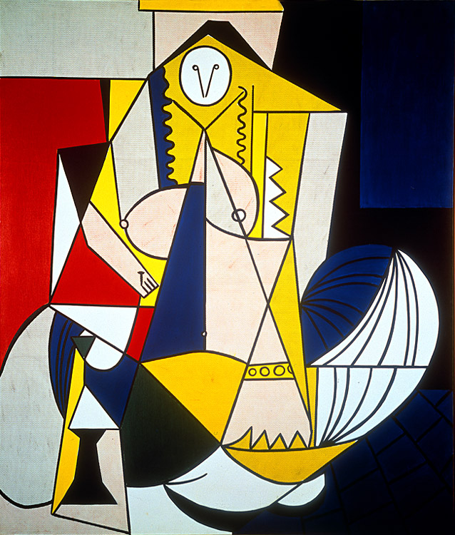
The exhibition explores in depth a number of major pieces with underlying political and pacifist themes, most notably Las Meninas (1957). Here Picasso reworks Velázquez's masterpiece to produce a bitter satire and a cruel indictment of Franco's dictatorship. Ceiling bosses become grotesque hooks for the suspension of torture victims, the painter becomes a figure from the Inquisition and the maid in the foreground has Franco's moustache. Likewise, Picasso's reworking of Poussin's and David's Rape of the Sabines, executed at height of Cuban Missile Crisis in 1962, portrays the classical scene in a new light: the Roman Empire, symbolic of all empires [USSR, US], is depicted as grotesque and barbaric.

Given that provincial galleries do not have the clout to attract the loans of significant pieces from the great collections in the way that major city retrospectives do, this was quite a remarkable piece of curation. Lynda Morris and Christoph Gruenberg are to be congratulated on putting together such a stimulating exhibition drawing on a Picasso's minor works.

Like all good exhibitions I left enlightened and informed, but also with a number of unanswered questions, - in this case they related to Picasso's relationship with the Nazis in occupied Paris; and the nature of his exile from his native Spain.

More information on the Tate Liverpool Picasso Peace and Freedom website.

The exhibition runs at Tate Liverpool until 28th August 2010. It can also be seen at:
The Albertina Vienna from 22nd September 2010 to 16th January 2011; and
Louisiana Museum of Modern Art, Denmark, from 11th February to 29th May 2011.

Tuesday, 3 August 2010

In the footsteps of ..... Henry Moore

When Henry Moore's studio in Hampstead was damaged during the Blitz in 1940 - he and his wife, Irina, rented Hoglands, a farmhouse in Perry Green in rural Hertfordshire, setting up his studio on one of the out-buildings. As is often the way with so many temporary measures, it soon became permanent one and he lived there until his death on 31 August 1986. Over the years, Moore purchased the cottage and the adjacent farmland, so that Perry Green today consists of an estate of some 70 acres comprising his home, workshops and an extensive sculpture garden with some 25 major pieces on display.

Perry Green reveals much about the post-war Moore. The Yellow Brick Studio, where Moore did much of his carving, gives a unique insight into various scuptural techniques, with examples of direct carving, lost wax casting, and of scaling up of the larger more monumental figures. Because Moore stipulated in his will that none of his work should be completed by his team of helpers after his death. The pieces on which he was working left mid-production - the small-scale maquette giving an indication of the final work, the polystyrene model the size and the unfinished plaster cast lacking the texture that he would have brought by hand over the subsequent weeks.

One of the barns houses temporary exhibitions. Henry Moore Deluxe: Books, Prints & Portfolios, which explores the stories behind many of his etchings and lithographs, is on display until the end of August.

The most enjoyable aspect of Perry Green by far is to walk amongst the sculptures knowing that, in most cases, this is where the artist chose to display them. The garden was to some extent Moore's shop window. One can only be impressed by the scale of some of the pieces, the largest of which (Large Figure in a Shelter, 1985-6) weighs over 21,000kg is some 7.62m high.

Before visiting Perry Green, I had not appreciated the extent to which Moore both ran a team of helpers who aided him in his work; and that Moore sent off many of his scuptures to foundaries [from Basingstoke to Berlin] to be cast. This was a considerable operation, with Moore the creative genius and director overseeing the artistic process.

For more information:
The Henry Moore Foundation, which is based at Perry Green, has an excellent interactive Virtual Perry Green.

Thursday, 22 July 2010

Anish Kapoor Exhibition, Guggenheim Museum, Bilbao

Anish Kapoor is a British-based Indian (born Bombay 1954) who has spent much of his career exploring the nature of sculpture. This major solo exhibition, presented jointly by The Royal Academy and The Gugenheim Museum Bilbao working in collaboration with the artist, poses important questions about the relationship between the sculptor and the viewer, the place of automation in the artistic process, and explores the boundary between two- and three- dimensional art. Each gallery marks a stage in Kapoor's development as he devoted his career to exploring these questions.
First gallery: Exploring the context (my title)
Here Kapoor presents us with a series of pieces all finished in a pigment?of primary colours The images themselves are unexceptional but Kapoor challenges the norms by presenting some of the images in unconventional places in the gallery such as in the top left hand corner of one of the main walls. The most interesting work in this room is a barely visible instilation - in fact it is its illusionary quality that makes the piece. Titled When I am pregnant (1992), it comprises a white convex bump that protudes out of the white display wall. Viewed straight on it is almost invisible - it has to be viewed laterally to be appreciated. Here Kapoor, by playing a trick on the viewer, challenges our perceptions of what constitutes art: the piece is both 3D and 'No'-D depending on the perspective of the observer.
Second Gallery: Exploring the void.
By creating three dimensional images containing dark spaces within them Kapoor invites the viewer to explore the nature of No-space. In hollowing out a section of sandstone and painting the interior Prussian Blue, Kapoor creates confusion for the viewer: is this a black image painted on the surface of the stone? Or is it a void hollowed out? The viewer's perception changes depending on the angle from which the piece is seen. Kapoor makes the most of the fact that the viewer is deprived of the key sense by which he can resolve his dilemma by the "Do not touch" rules of the gallery.
Third Gallery: Exploring the artistic process I.
Here Kapoor has created a series of objects made of concrete through a Computer-aided Manufacturing technique partly borrowed from the food processing industry. The result is a series of piles of "excretions" of varying shapes. Kapoor's methodology challenges the traditional view of the sculptor as artist and poses questions about the mechanisation of the artistic product - a theme to which Kapoor returns again in his work and in the exhibition.

Fourth Gallery: Exploring perspective.

Kapoor is perhaps best known for his public sculptures using highly polished stainless steel to create mirror structures (e.g. his monumental Cloud Gate in Chicago). By using convex and concave mirrors Kapoor encourages the viewer to participate in the artistic process as their shifting perspective alters the nature of the image. Thus the artist does not define the image, rather he facilitates it.
Fifth and Sixth Galleries: Exploring the artistic process II and III.
A cannon fires shells of red wax into the corner of a gallery creating a bloody splurge of devastation trailing down the walls. A 3m beam moves like the minute hand a clock over a bed of deep red Vaseline sculpting and re-forming the surface with each rotation. Deep red is clearly an important colour for Kapoor and gives these two monumental pieces Isomewhat macabre feel. Like the First Cause, Kapoor has started the process bringing his creation into being but thereafter plays the role only of ambivalent observer.
This was a fascinating exhibition that satisfied the mind not the senses.

Sunday, 11 April 2010

Henry Moore at Tate Britain

Apart from seeing pieces in isolation in various galleries around the world, this was my first real experience of Moore's work and I found Henry Moore at Tate Britain an invaluable introduction to the subject. I always find it helpful and reassuring when an exhibition follows a straightforward biopic structure, and thus the exhibition did not disappoint. I recommend it to anyone who wants to get to know the work of Henry Moore.

Moore's early work (1920s) was heavily informed by African and North American ethnographical studies and art [Room 1]. The exhibition focuses in particular on his fascination with the Mother and Child imagery that characterised much of his work during this period [Room 2].

Moore's relationship with Modernism in the 1930s is explored in depth [Room 3 and Room 4]. This was the period in which he developed his characteristic style and earned international reputation. His subject matter was wide-ranging embracing the famous reclining figures and revisiting his earlier themes of mother and child in innovative ways. Moore's work during this period was not totally immune from the wider artistic influence of Surrealism and the inspiration, at different times, both of geometry and of nature.

The most surprising aspect of this exhibition for me was Moore's wartime work as a graphic artist depicting scenes of Londoners sheltering from the Blitz in the Underground. Moore abandoned sculpture during the war year and his powerful images which portray the subjects more as if they were corpses in a mortuary, are really quite disturbing [Room 5].

Post-war Moore returned to three-dimensions but much of his work of this period was characterised but dark and harsh imagery, perhaps reflecting the shadow cast by the war and by the new era of the Cold War the bomb [Room 6].

The exhibition closes on a much more optimistic note with four magnificent elm sculptures of reclining figures of over-sized human proportions [Room 7].

Having had such an interesting taste of Moore's work, I am intend to see the exhibition again over the over months and plan to visit to his former home at Perry Green, Herts, where more monumental sculptures await.

Henry Moore at Tate Britain runs until 8th August 2010.

Wednesday, 22 July 2009

When does Graffiti become art?

Wandering around Covent Garden yesterday, I happened upon an exhibition of some of the work by Banksy, formerly the notorious scourge of Bristol, but now the enigmatic respectable graffiti artist.

In some ways the whole concept of a Banksy exhibition is rather flawed. I am not sure that a gallery - albeit one in a derelict building in the West End - is really in the true spirit of graffiti art that made Banksy's name. It seemed even odder to view framed works by the artist, whose work sells at auction for over £50k.

However, one picture perhaps gives us a clue that Banksy has not really sold out - perhaps he's just winding up a different audience!


The Unofficial Banksy exhibition is at The Flower Cellars, 4-6 Russell Street, London.


I'm not really convinced about graffiti as art, but given that we have decided to project ourselves as a nation to the international community with a graffiti-inspired Olympic logo, who am I to judge?

Monday, 20 April 2009

Pollock v. Rothko - an abstract battle to contemplate

It is very easy to knock abstract modern art in general and the large works of Jackson Pollock [AKA "Jack-the-Dripper"] and Mark Rothko in particular. In both cases the "a child could have done that" factor is never far from the surface and that the Tate may have hung a Rothko on its side didn't help. I am not qualified to be an advocate of their artistic merit or otherwise but, having spent a couple of hours in New York's MoMA last week drinking in some of their canvasses, I must say that I do find some of these two artists' works most therapeutic.

With Pollock, you never see the same thing twice - he doesn't direct you to what he wants you to see, he just leaves you to your thoughts. At risk of sounding too Jungian, he seems to go straight for the unconscious mind. The scale of his One: Number 31, 1950 is awesome - I got lost in there for an age.

Contemplating Rothko is similar, but harder work. I managed to get to the recent Tate Modern exhibition on three occasions and was able to spend some time with those monumental Seagram Murals, so was very pleased to be able to follow this up at MoMA. Rothko's No. 16 (Red, Brown and Black) 1958 was particularly striking. There is something about the tones in these great blocks of colour that is somehow both challenging and reassuring.

Of the two, I would take Pollock's works every time. The poster for the Pollock exhibition at the Tate in 1999 used the tag line, "You can always spot a Pollock - it has genius splashed all over it" - they were not wrong.

A Jackson Pollock on the wall of my study would certainly help keep the day-to-day issues at work in perspective, but I am not sure that I would get a lot of work done.